Summary: in this tutorial, you will learn how to use React portals to render children into a DOM node outside the parent component’s DOM hierarchy.
Introduction to React portals
React portals provide a way to render children into a DOM node outside the parent component’s DOM hierarchy.
React portals can be useful when rendering components outside the regular DOM hierarchy such as modals, tooltips, or dropdowns.
To create a portal, you use the ReactDOM.createPortal() function. The createPortal function takes two arguments:
- JSX content to render.
- A DOM node where you want to render the JSX content.
We’ll create a reusable modal component in React to demonstrate the React portals.
Creating a new React project
First, open your terminal and run this command to create a new React project:
npx create-react-app react-portalsCode language: JavaScript (javascript)Second, navigate to the react-portals directory.
cd react-portalsCode language: JavaScript (javascript)Third, run the following command to start the React app:
npm startCode language: JavaScript (javascript)We’ll delete all files in the src directory and start from scratch.
Creating the first version of the modal
Step 1. Create an index.js file that shows the App component on the screen:
import ReactDOM from 'react-dom/client';
import App from './App';

const el = document.querySelector('#root');
const root = ReactDOM.createRoot(el);

root.render(<App />);Code language: JavaScript (javascript)
Step 2. Create the App component:
import { useState } from 'react';

const App = () => {
  return (
    <div className="container">
       Modal
    </div>
  );
};

export default App;Code language: JavaScript (javascript)
Step 3. Create the Modal component:
import './Modal.css';

const Modal = () => {
  return (
    <div className="modal-container">
        Modal
    </div>
  );
};

export default Modal;Code language: JavaScript (javascript)
Step 4. Create an empty Modal.css file.
Step 5. Enhancing the App component to display the modal.
import { useState } from 'react';
import Modal from './Modal';

const App = () => {
  const [showModal, setShowModal] = useState(false);

  const handleClick = () => setShowModal(!showModal);

  return (
    <div className="container">
      <button type="button" onClick={handleClick}>
        Open
      </button>
      {showModal && <Modal />}
    </div>
  );
};

export default App;Code language: JavaScript (javascript)
The App component uses the showModal state to show/hide the modal. If the showModal is true, the Modal component will display, and if false the Modal component won’t display.
The App component also has a button that opens the modal when clicked. When the click event occurs, we flip the value of the showModal state from false to true to show the modal.
Step 6. Showing contents on the modal.
import './Modal.css';
const Modal = () => {
return (
<div className="modal-container">
<div className="modal">
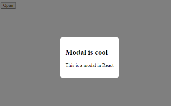
<h2>Modal is cool </h2>
<p>This is a modal in React</p>
</div>
</div>
);
};
export default Modal;Code language: JavaScript (javascript)Step 7. Adding the style to the Modal.css file:
.modal-container {
  /* create an overlay */
  position: absolute;
  inset: 0;
  background-color: rgba(0, 0, 0, 0.5);

  /* center the modal */
  display: flex;
  justify-content: center;
  align-items: center;
}

.modal {
  background-color: white;
  padding: 1rem;
  border-radius: 0.5rem;
}Code language: JavaScript (javascript)
When you click the button, the modal will display:
It works because we use the absolute position in .modal-container element and all of the parent element has no position other than static.
Suppose the .container element has the position set to relative in the Modal.css file, then the modal will not work correctly.
.container {
  position: relative;
}

/* other rules */Code language: JavaScript (javascript)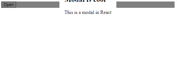
To fix this issue, we need to render the modal under the body element instead of the .container element. To do that we will use the React portals.
Using React portals
Step 1. Add a div with the class .model-wrapper directly under the body element in the public/index.html file:
...
 <body>
    <noscript>You need to enable JavaScript to run this app.</noscript>
    <div id="root"></div>

    <div class="modal-wrapper"></div>
  </body>
...Code language: JavaScript (javascript)
Step 2. Render the modal using React portals.
Use the ReactDOM.createPortal() function to render the modal component within the .modal-wrapper element:
import ReactDOM from 'react-dom';
import './Modal.css';

const Modal = () => {
  return ReactDOM.createPortal(
   <div className="modal-container">
      <div className="modal">
        <h2>Modal is cool </h2>
        <p>This is a modal in React</p>
      </div>
    </div>,
    document.querySelector('.modal-wrapper')
  );
};

export default Modal;Code language: JavaScript (javascript)
If you click the open button, the modal will display properly.
So far, the modal only has static content. Typically, the modal includes dynamic content provided by the parent component and has a button to close itself. To add these features to the Modal components, we can use props.
Step 3. Enhance the App component:
import { useState } from 'react';
import Modal from './Modal';

const App = () => {
  const [showModal, setShowModal] = useState(false);

  const handleClick = () => setShowModal(!showModal);
  const handleClose = () => setShowModal(false);

  const actions = (
    <button type="button" onClick={handleClose}>
      Close
    </button>
  );

  const modal = (
    <Modal onClose={handleClose} actions={actions}>
      <p>This is a modal!</p>
    </Modal>
  );

  return (
    <div className="container">
      <button type="button" onClick={handleClick}>
        Open
      </button>

      {showModal && modal}
    </div>
  );
};

export default App;Code language: JavaScript (javascript)
How it works.
First, add the onClose and actions props to the Modal component.
<Modal onClose={handleClose} actions={actions}>Code language: JavaScript (javascript)Second, provide child components to the Modal component by placing them between the opening and closing tags:
<Modal onClose={handleClose} actions={actions}>
    <p>This is a modal!</p>
</Modal>Code language: JavaScript (javascript)
Note that you can place any contents between the <Modal> and </Modal> tags. In the Modal component, they will be stored in the children prop.
Third, define actions for the modal that includes the Close button and register the handleClose event handler to the click event:
const actions = (
    <button type="button" onClick={handleClose}>
      Close
    </button>
);Code language: JavaScript (javascript)
Finally, set the showModal state to false in the handleClose function to close the modal:
const handleClose = () => setShowModal(false);Code language: JavaScript (javascript)Step 4. Add props to the Modal component.
Add the onClose, children, and actions props to the Modal component:
import ReactDOM from 'react-dom';
import './Modal.css';

const Modal = ({ onClose, children, actions }) => {
  return ReactDOM.createPortal(
    <div className="modal-container" onClick={onClose}>
      <div className="modal">
        {children}
        {actions}
      </div>
    </div>,
    document.querySelector('.modal-wrapper')
  );
};

export default Modal;Code language: JavaScript (javascript)
In the Modal component:
- Register the
onClosefunction to the click event of the.modal-containerelement to close the modal when the overlay is clicked. - Render the children and actions props.
If you click the Open button, the modal will display. When you click the overlay or the Close button, the modal will close.
But when you click inside the model, it will also close. This is unexpected behavior. The reason is that the click event is propagated from the from .modal-container‘s child elements to the .modal-container element.
To stop the event from propagating from the child elements to the parent elements, you can use the stopPropagation() method of the event object.
import ReactDOM from 'react-dom';
import './Modal.css';

const Modal = ({ onClose, children, actions }) => {

  const handleClick = (e) => e.stopPropagation();

  return ReactDOM.createPortal(
    <div className="modal-container" onClick={onClose}>
      <div className="modal" onClick={handleClick}>
        {children}
        {actions}
      </div>
    </div>,
    document.querySelector('.modal-wrapper')
  );
};

export default Modal;Code language: JavaScript (javascript)
How it works.
First, add the onClick prop to the .modal element:
<div className="modal" onClick={handleClick}>Code language: JavaScript (javascript)Second, stop propagating the event by calling the stopPropagation() method of the event object in the handeClick function:
const handleClick = (e) => e.stopPropagation();Code language: JavaScript (javascript)Now, if you click inside the modal except for the Close button, the modal will not close.
Fixing the scrolling issue
If the App component has long content and you scroll it, the overlay will not cover the entire screen.
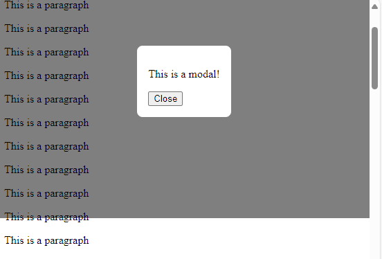
To fix this, you can change the position of the .modal-container from absolute to fixed:
.modal-container {
  /* create an overlay */
  position: absolute;
  inset: 0;
  background-color: rgba(0, 0, 0, 0.5);

  /* center the modal */
  display: flex;
  justify-content: center;
  align-items: center;
}Code language: CSS (css)
Downloading React Modal project source code
Download the React Modal project source code
Summary
- Use React portals to render children into a DOM node outside the parent component’s DOM hierarchy.