Summary: in this tutorial, you will learn how to use the Flexbox model to arrange components in your mobile apps.
React Native uses the Flexbox layout algorithm to create layouts for components. Flexbox in React Native is similar to the one for the web with some minor differences:
| Feature | React Native | Web |
|---|---|---|
| The display property | Implicitly include display: 'flex' | Must explicitly specify display: flex |
| Default flex direction | Default to column: flexDirection: 'column' | Default to row: flex-direction: row |
| Flex property | Accept one value: flex: flex-basis | One to three values:flex: flex-grow flex-shrink flex-basis |
Flex container and items
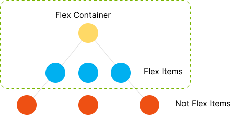
When a component has the display: 'flex', it becomes a flex container. All direct children will be the flex items:
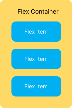
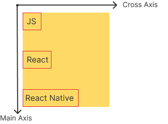
For example:
<View style={{ display: 'flex'}}>
    <Text>JS</Text>
    <Text>React</Text>
    <Text>React Native</Text>
</View>Code language: HTML, XML (xml)
In this example, the View is a flex container and the Text components are flex items:

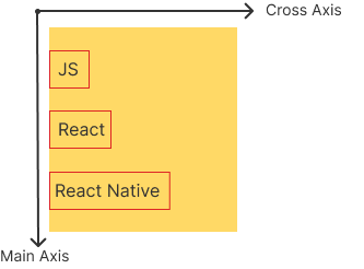
Note that only the direct children of the flex container are flex items whereas the indirect child components are not. For example:
<View style={{ display: 'flex'}}>
    <Pressable>
        <Text>JS</Text>
    </Pressable>
    <Pressable>
        <Text>React</Text>
    </Pressable>
    <Pressable>
        <Text>React Native</Text>
    </Pressable>
</View>Code language: HTML, XML (xml)
In this example, the Pressable components are the flex items but the Text components are not because they are the indirect children of the View component:
In React Native, the following component uses the flexbox layout by default. This means that you don’t have to specify the display: 'flex' explicitly:
- View
- ScrollView
- SafeAreaView
- FlatList
- SectionList
- VirtualizedList
Flex Direction
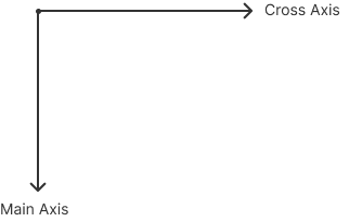
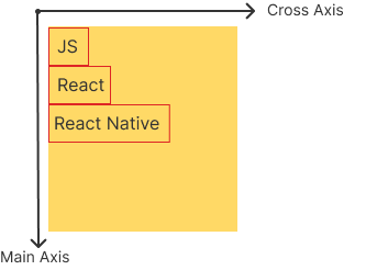
Flex layout uses two implicit axes: the main and cross axes.
If the flexDirection is set to 'column', the main axis is from top to bottom and the cross axis is from left to right:
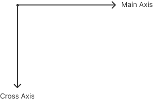
If the flexDirection is set to 'row', the main axis is from left to right and the cross axis is from top to bottom:
To use Flexbox effectively, you often combine the alignItems and flexDirection properties.
alignItems
The alignItems align individual flex items on the cross axis of the flex container. The alignItems property accepts the following values:
- stretch (default)
- flex-start
- flex-end
- center
- baseline
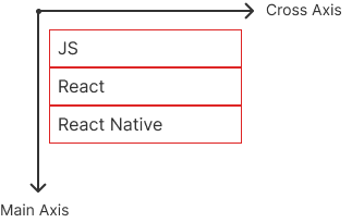
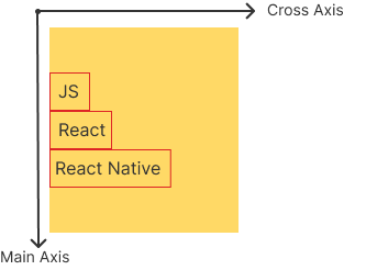
stretch
alignItems stretch will stretch all flex items on the cross axis. Note that the alignItems defaults to stretch:
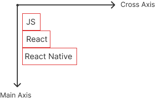
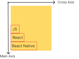
flex-start
When the alignItems is set to flex-start, it aligns flex items to the start of the cross axis of the flex container:
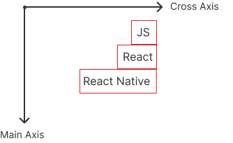
flex-end
If you set the alignItems is set to flex-end, it aligns flex items to the end of the cross axis of the flex container:
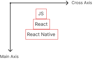
center
The alignItems center will place the flex items at the center of the cross axis:
The following program illustrates the alignItems:
baseline
The alignItems baseline will align flex items along the same baseline when the flexDirection is set to 'row':
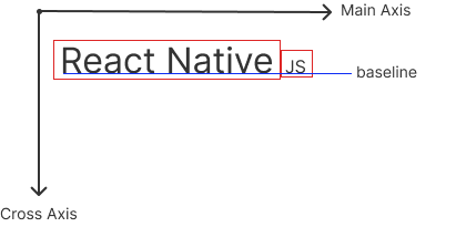
The following program illustrates the alignItems baseline:
justifyContent
The justifyContent aligns flex items as a group (not individual items like alignItems) along the main axis of the flex container.
The justifyContent accepts one of the following values:
flex-startflex-endspace-betweenspace-evenlyspace-aroundcenter
The following app illustrates how the justifyContent works:
flex-start
The justifyContent flex-start aligns flex items as a group to the start of the flex container’s main axis.
flex-end
The justifyContent flex-end aligns flex items as a group to the end of the flex container’s main axis.
center
The justifyContent center aligns the flex items as a group to the center of the flex container’s main axis.
space-between
The justifyContent space-between distributes the space between the flex items evenly along the flex container’s main axis:
space-evenly
The justifyContent space-evenly arranges flex items with equal space around them in the flex container’s main axis:
space-around
The justifyContent space-around spaces off flex items across the flex container’s main axis, distributing the remaining space around the flex items.
The following table illustrates the differences between space-between, space-around, and space-evenly:
| Property | Description | Visual Layout (Vertical) |
|---|---|---|
space-between | Distributes space between flex items. No space at the start and end. | | Item 1 | — space — | Item 2 | — space — | Item 3 | |
space-around | Distributes space around flex items. Equal space before, between, and after each flex item. Start/end space is half of the space between flex items. | — 1/2 space — | Item 1 | — space — | Item 2 | — space — | Item 3 | — 1/2 space — |
space-evenly | Distributes space evenly between flex items. Equal space between each flex item, including the start and end. | — space — | Item 1 | — space — | Item 2 | — space — | Item 3 | — space — |
Summary
- React Native uses the flexbox layout to arrange components.
- Use the
alignItemsto align flex items on the cross-axis of the flex’s container. - Use the
flexDirectionto align the flex items on the main axis of the flex’s container.